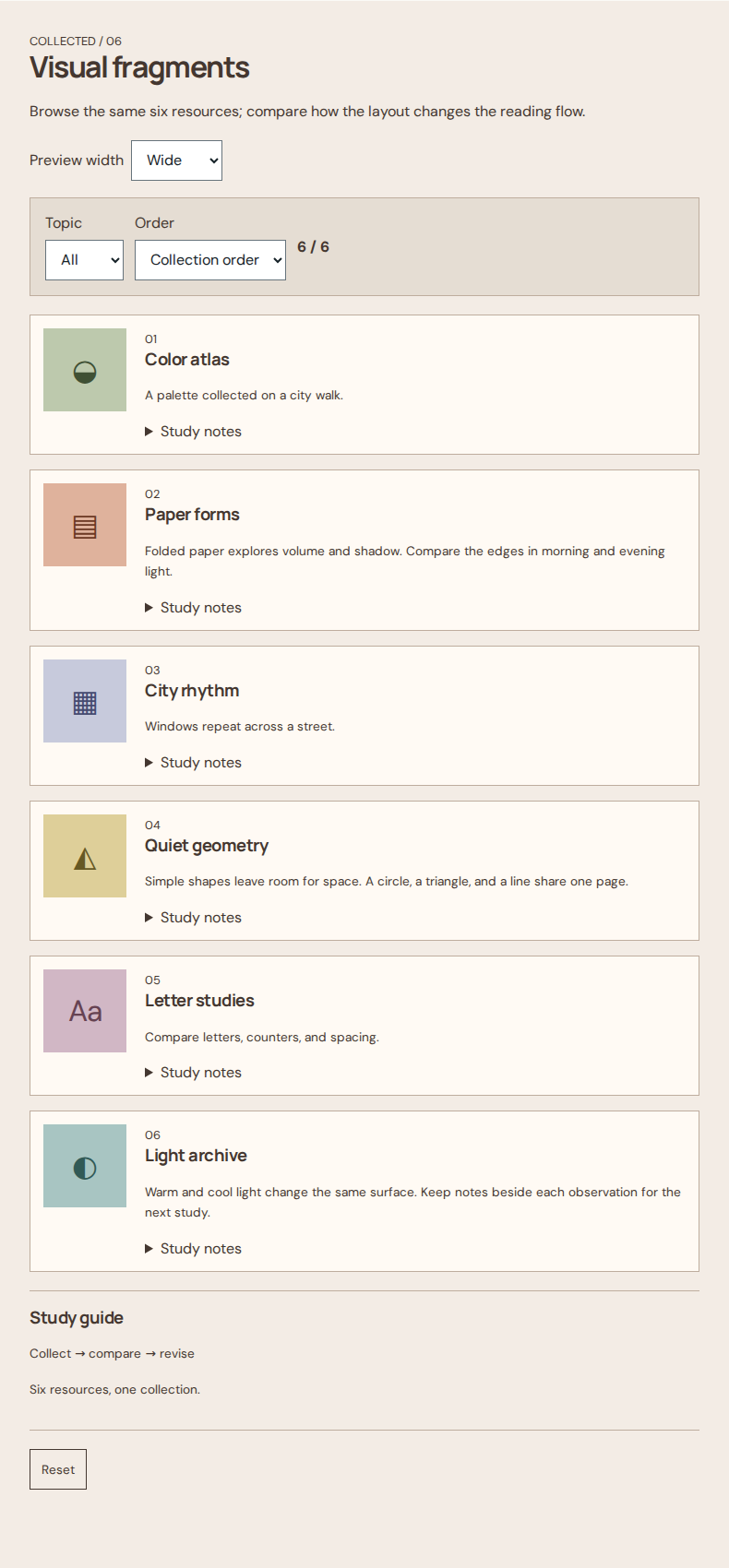
List layout
Compare the same six resources.
Open field noteExplore Content arrangement.
3 field notes
| Concept | Features | Advantages | Limitations | Suitable situations | Combination conditions |
|---|---|---|---|---|---|
| List layout | Repeated rows keep title, summary, and metadata in predictable positions. | Stable metadata positions support quick comparison. | Long summaries can hide the pattern; keep row content concise. | Choose it for scanning and comparing text-heavy items. | A list can fill the main region of a two-column page. |
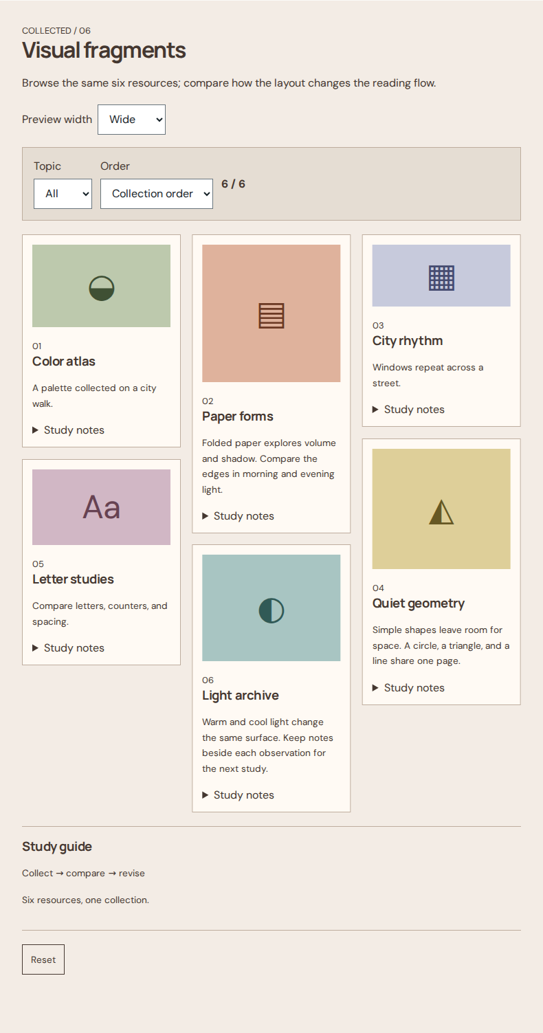
| Masonry | Cards of different heights enter the shortest available column. | Short columns absorb cards without uniform row gaps. | Test keyboard order and overlap after expansion; on narrow screens use one column. | Choose it for visual collections. | Minimal card styling can keep varied images prominent. |
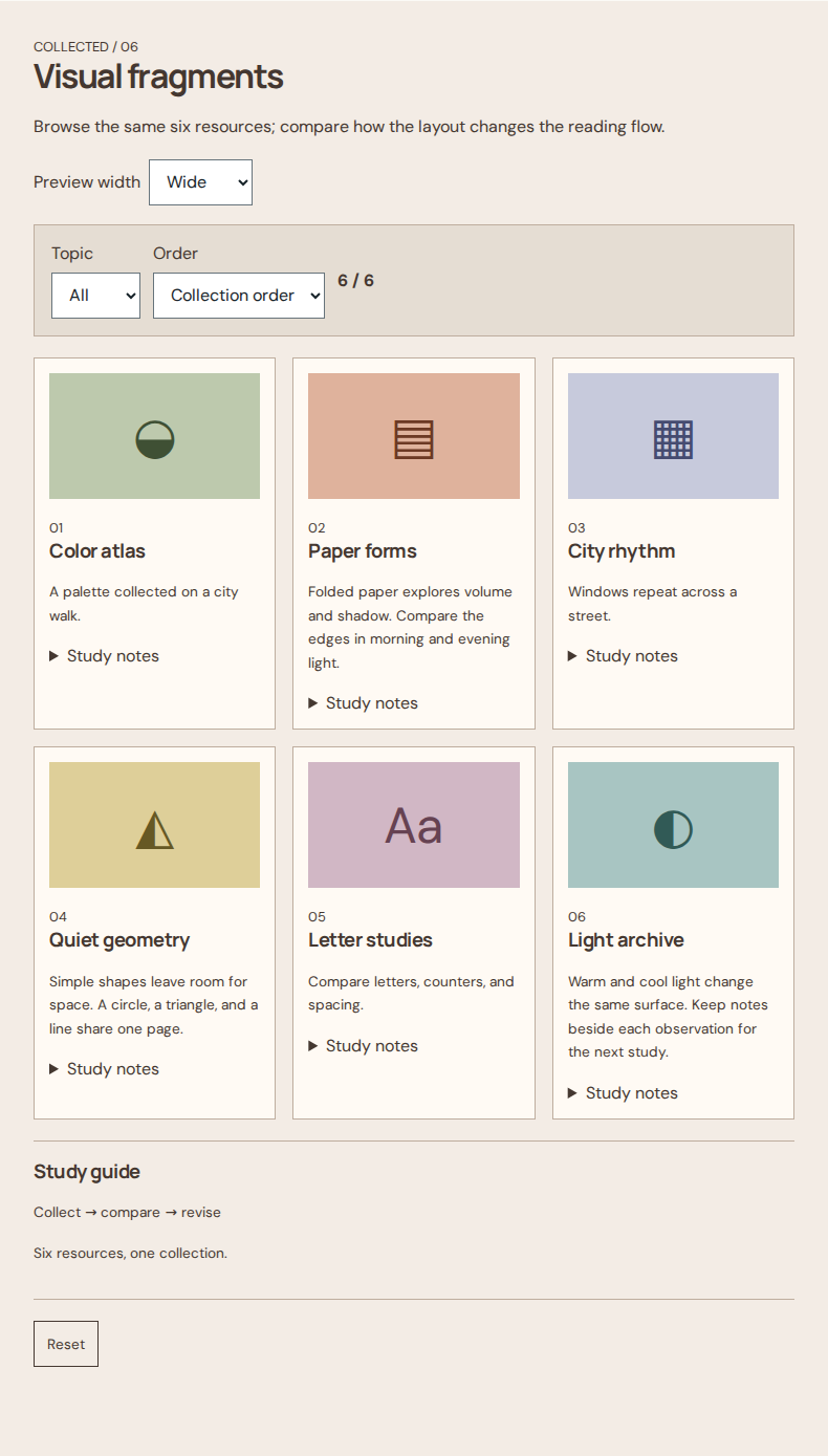
| Uniform grid | Equal-width cards align in shared rows. | Shared rows make similarly structured resources comparable. | Uneven content can leave empty space inside taller rows. | Choose it for comparable resources with similar information. | Flat surfaces preserve card boundaries without extra depth. |