List layout
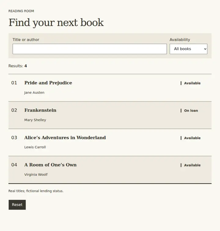
Repeated rows align text and metadata when scanning comparable fields matters more than image variety.
Open field noteCompare screen layout, visual expression, and text treatment to decide how people read and interact.
Search within: Design
22 field notes
Repeated rows align text and metadata when scanning comparable fields matters more than image variety.
Open field note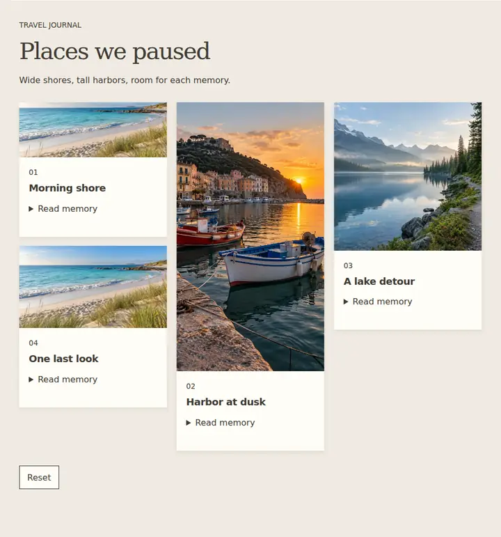
Pack varied-height items into short columns when preserving image proportions matters more than shared rows.
Open field note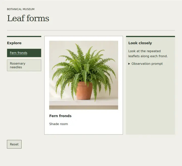
Coordinate navigation, active content and context in distinct regions when they must be seen together.
Open field note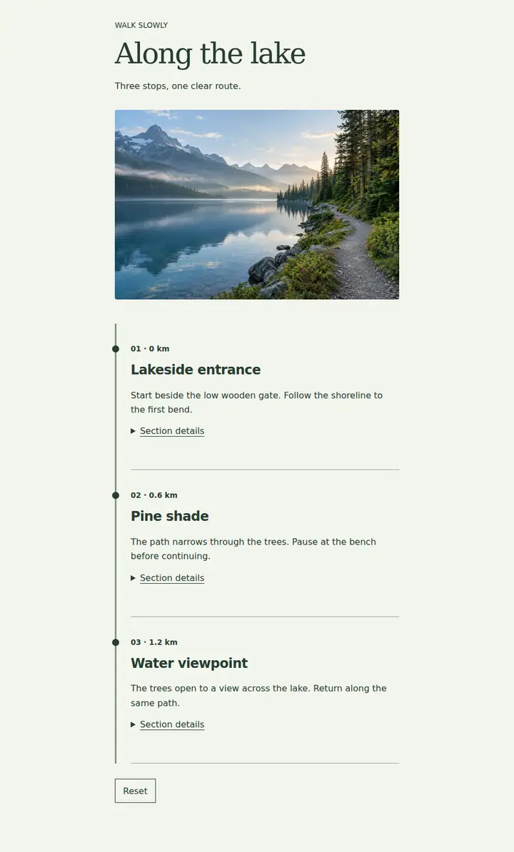
One vertical reading stream suits content whose next step should be unambiguous.
Open field note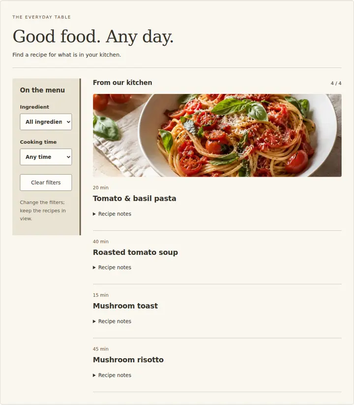
Keep navigation, filters or supporting information beside the main content so both remain available.
Open field note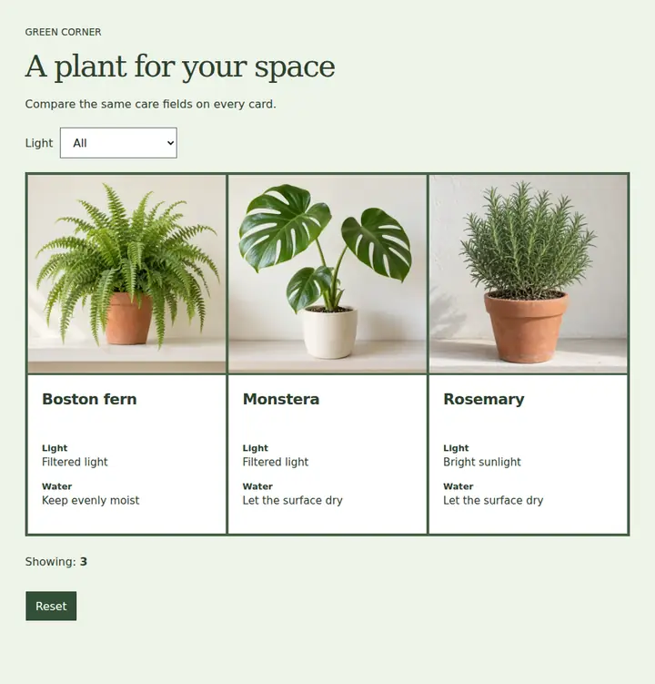
Equal-width cards and shared rows support fair comparison of similarly structured items.
Open field note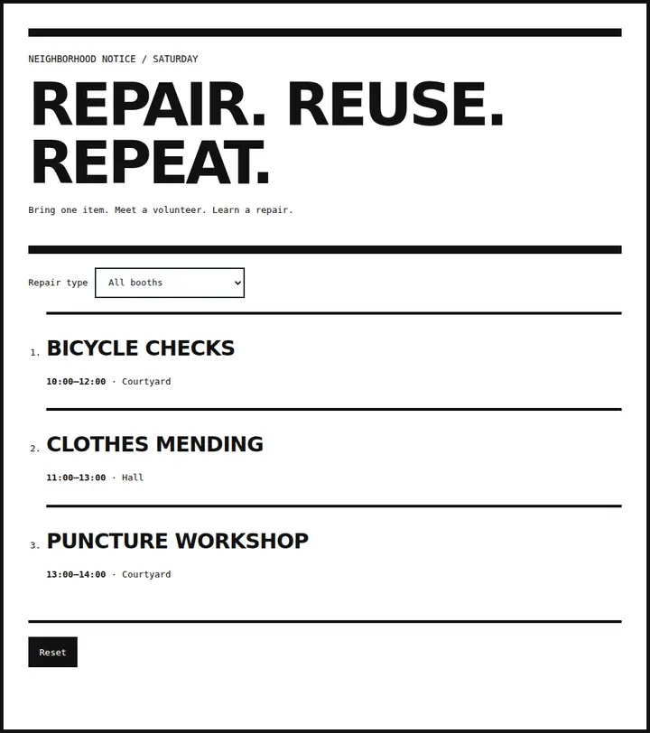
Raw typography and exposed structure suit an intentionally utilitarian visual voice.
Open field note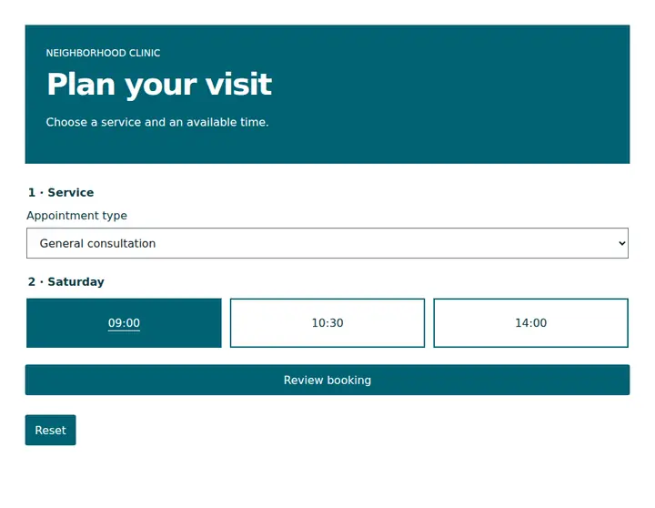
Solid surfaces and explicit labels establish hierarchy when simulated depth adds little value.
Open field note
Use translucent, blurred panels to preserve background context while keeping foreground content readable.
Open field note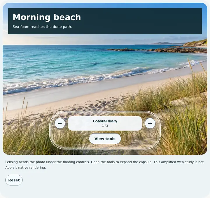
An adaptive, floating control material preserves rich content beneath a distinct navigation layer.
Open field note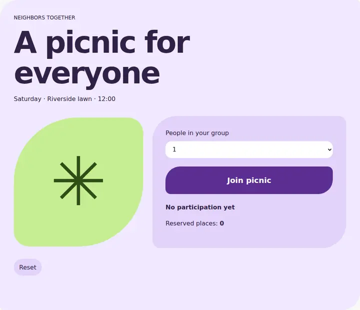
Color, shape, size and motion emphasize key actions within the Material design system.
Open field note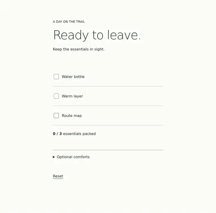
Reduce competing elements to focus attention while retaining essential information and controls.
Open field note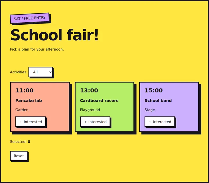
Bright blocks, thick outlines and hard shadows give selected content deliberate graphic emphasis.
Open field note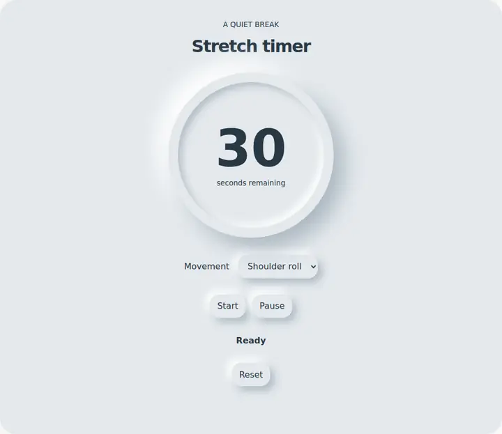
Similar-tone surfaces and paired shadows suggest soft raised or pressed controls.
Open field note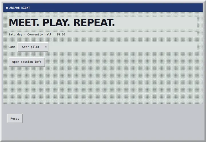
Early-computer windows, pixel details and type evoke a deliberate digital nostalgia.
Open field note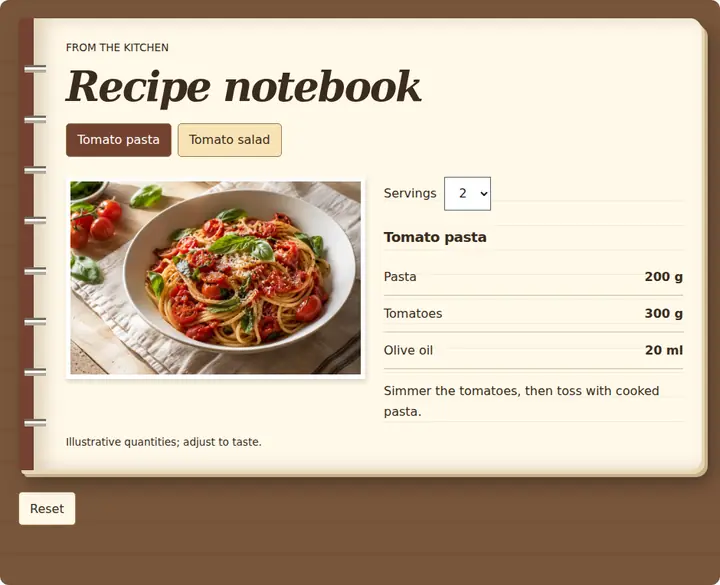
Familiar object and material cues explain digital content through a recognizable physical metaphor.
Open field note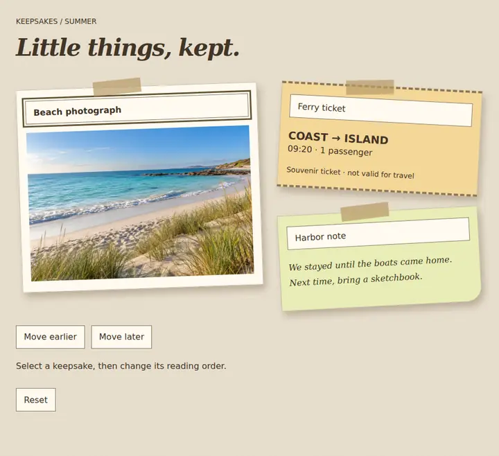
Layered paper, tape and fragments create an assembled, handmade visual character.
Open field note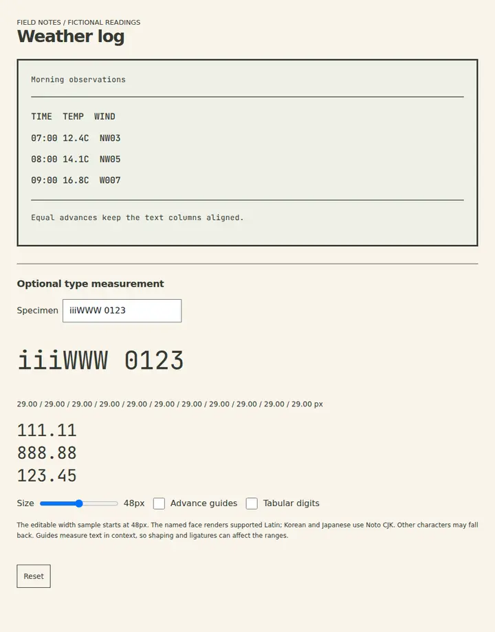
Equal character advances suit aligned text data; shape and fallback coverage remain separate concerns.
Open field note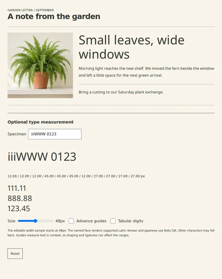
Varying character advances suit flowing text; letter spacing is a separate adjustment.
Open field note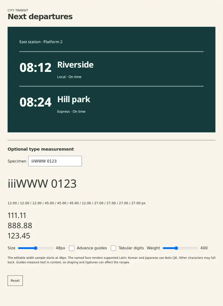
Letterforms without serifs suit a plain visual voice; readability still depends on the chosen face and context.
Open field note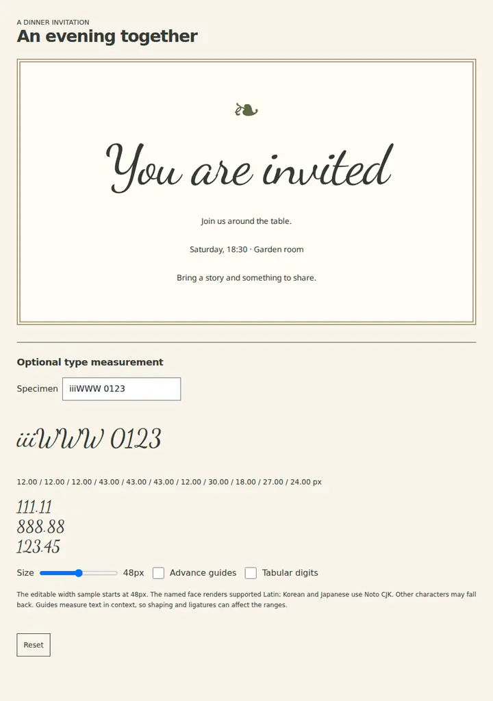
Handwritten strokes suit short expressive lettering while ordinary text carries detailed instructions.
Open field note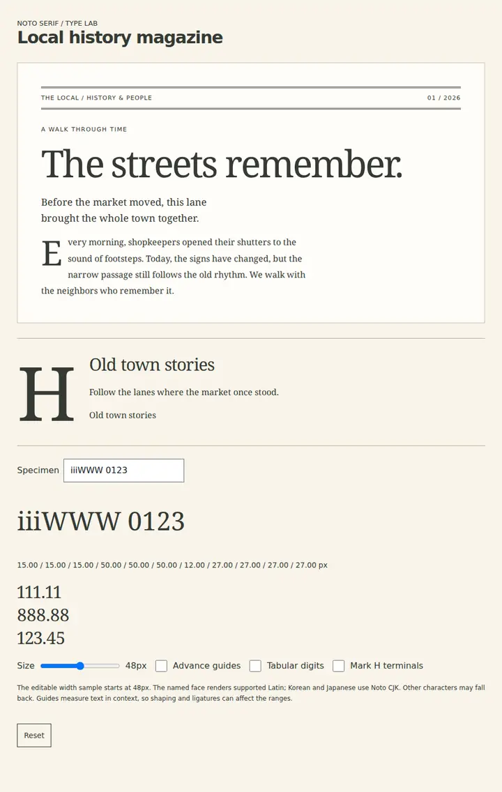
Finishing strokes at letter terminals create a distinct text texture; choose by editorial tone and tested legibility.
Open field note