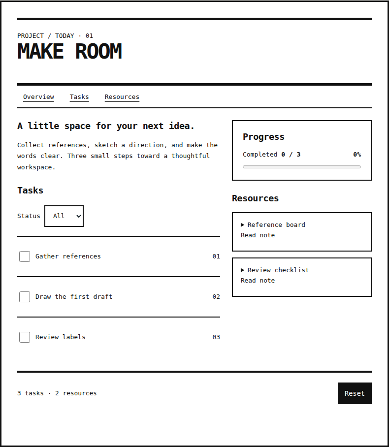
Brutalism
Explore the same project workspace.
Open field noteExplore Styles.
11 field notes
Explore the same project workspace.
Open field note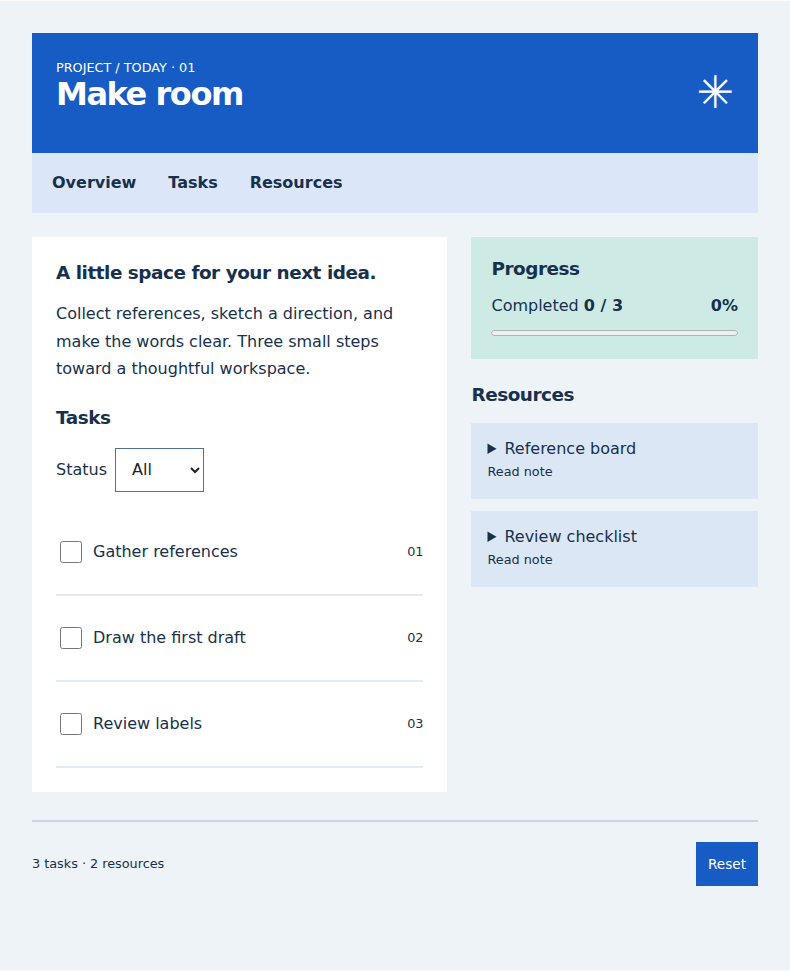
Explore the same project workspace.
Open field note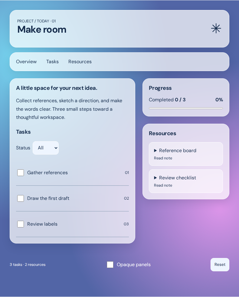
Explore the same project workspace.
Open field note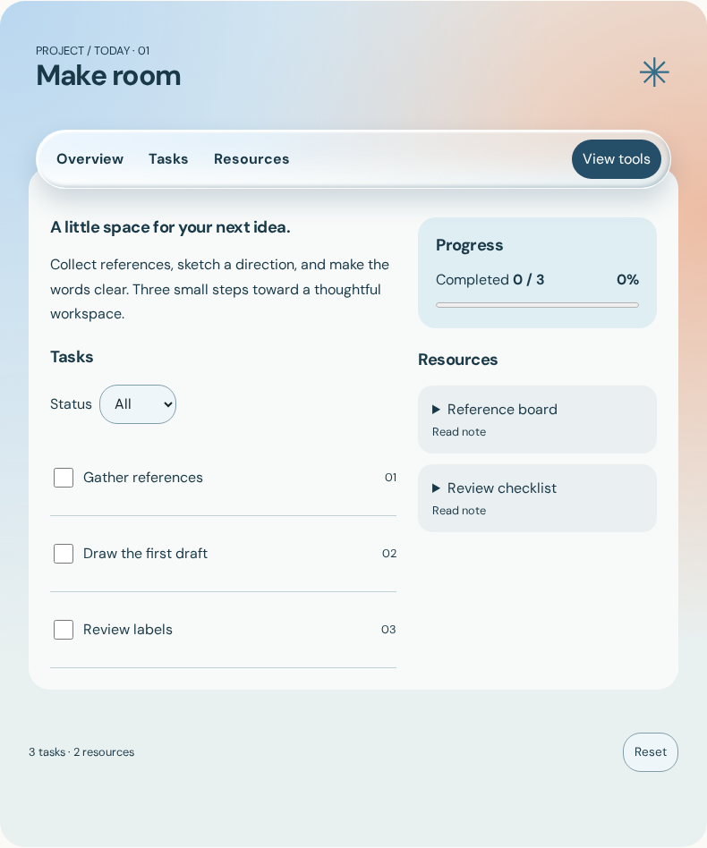
Explore the same project workspace.
Open field note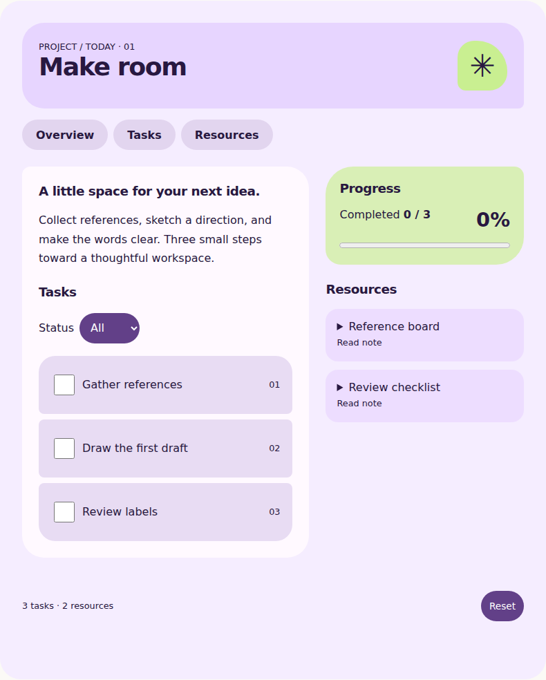
Explore the same project workspace.
Open field note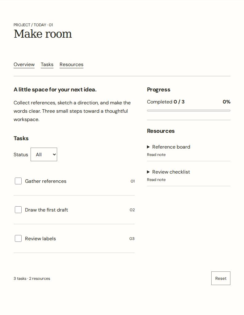
Explore the same project workspace.
Open field note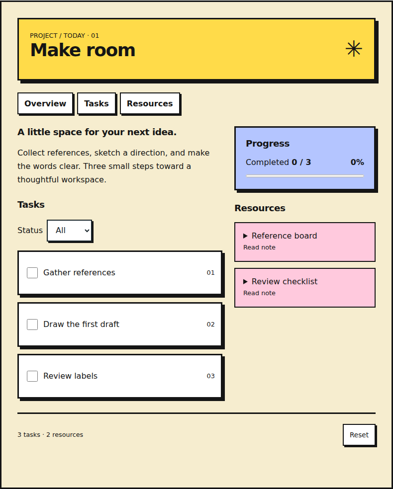
Explore the same project workspace.
Open field note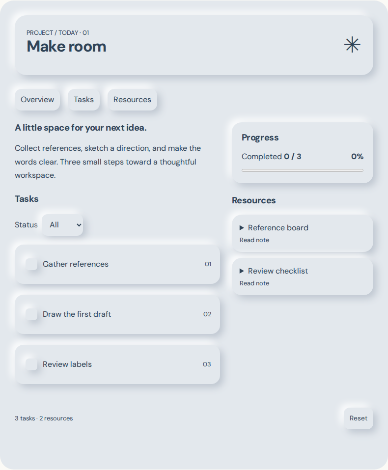
Explore the same project workspace.
Open field note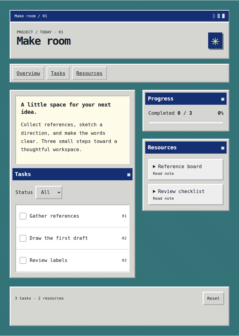
Explore the same project workspace.
Open field note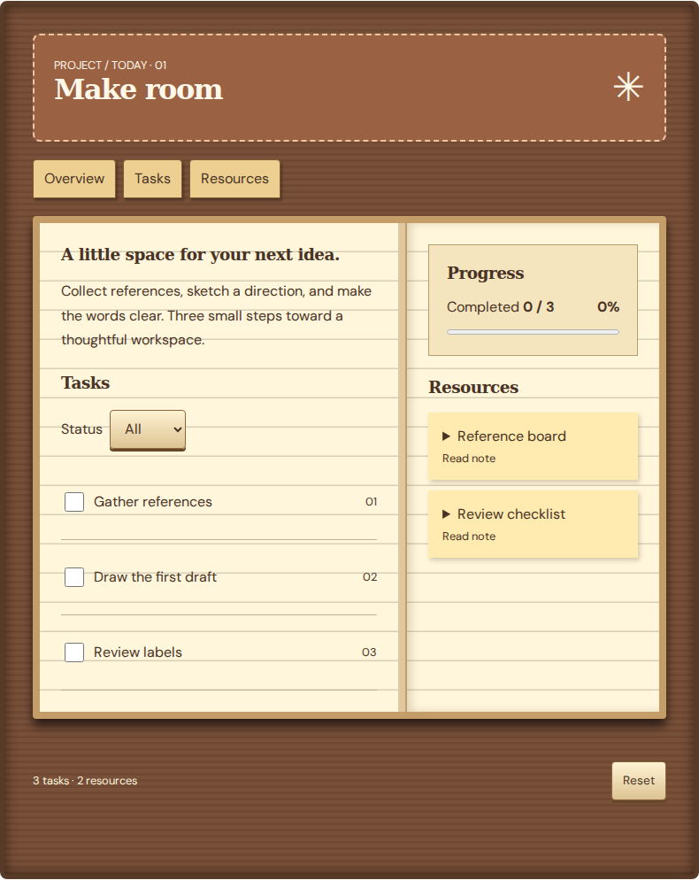
Explore the same project workspace.
Open field note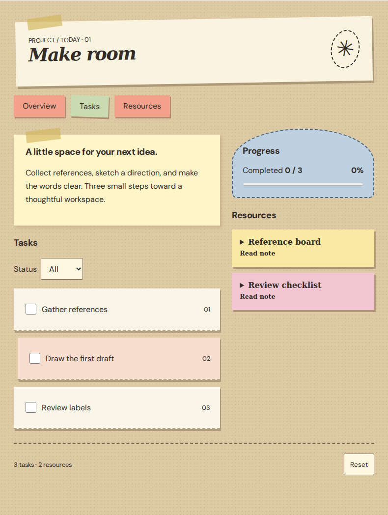
Explore the same project workspace.
Open field note| Concept | Features | Advantages | Limitations | Suitable situations | Combination conditions |
|---|---|---|---|---|---|
| Brutalism | Exposed rules and raw typography make structure visible. Raw rules and underlined navigation expose the structure. | Exposed rules make task boundaries explicit. | The rough tone can distract; keep links underlined and controls recognizable. | Choose it for a utilitarian task list. | A list or single column supports sequential task scanning. |
| Flat design | Solid surfaces and clear labels establish hierarchy without simulated depth. Solid color regions separate roles without decorative depth. | Labels and solid fills separate tasks and actions clearly. | Without depth cues, boundaries and labels must keep actions easy to recognize. | Choose it for routine task management. | List rows work for tasks; uniform grids work for project summaries. |
| Glassmorphism | Translucent panels reveal a blurred background. Opaque panels replace the frosted surfaces when selected. | Translucent panels retain the background context. | Contrast depends on the backdrop; offer an opaque mode and test each scene. | Choose it when background context matters. | Pair with a simple grid and an opaque readability fallback. |
| Liquid Glass | Floating capsules, reflective edges, and expanding tools separate navigation from content. | The light navigation layer preserves visual context. | Transparency needs contrast checks and an opaque fallback. | Choose it for a small navigation layer over rich content. | Keep task surfaces solid; avoid stacking glass layers. |
| Material 3 Expressive | Color blocks, varied curves, large controls, and brief shape reactions. | Size and containment give primary actions emphasis. | Expressive shapes must preserve familiar labels and reading order. | Choose it when key actions need clear visual emphasis. | Pair solid surfaces with a clear grid and reduced-motion support. |
| Minimalism | Limited elements and generous space focus attention on essential content. Whitespace and restrained type keep all project content legible. | Space concentrates attention on essential tasks. | Removing navigation or unique information weakens the task rather than simplifying it. | Choose it for a focused workflow. | Serif or sans-serif can support the same restrained layout. |
| Neobrutalism | Bright blocks, thick outlines, and hard offset shadows create graphic emphasis. Bold outlines and hard shadows give the panels a graphic weight. | Strong blocks emphasize tasks and actions. | Dense decoration competes with details; reserve strong emphasis for key information. | Choose it for a small interface with a bold voice. | Keep repeated task rows concise. |
| Neumorphism | Same-tone surfaces use upper-left highlights and lower-right shadows, without resting borders. The checked row sinks inward; its tick and strike-through remain without shadows. | Soft depth reinforces the physical control metaphor. | Ticks, strike-through, and counts must survive shadow removal; retain focus and forced-color outlines. | Choose it for a small control panel. | A minimal layout leaves space for shadows and explicit labels. |
| Retro digital | Title bars, beveled windows, pixel ornaments, and fixed-width type. | Window groups make the project feel like a compact desktop. | Nostalgic decoration must not shrink text or imply unavailable actions. | Choose it for a playful, compact workspace. | Combine window framing with modern reflow and native controls. |
| Skeuomorphism | Recognizable materials and objects explain a digital task. The workspace opens as a paper notebook on a wooden surface. | Paper and cover metaphors make a familiar checklist. | Decorative realism consumes space; keep task controls explicit. | Choose a familiar metaphor that supports the task. | A single reading column can sit inside the paper surface. |
| Tactile collage | Layered paper fragments, tape, irregular edges, and annotations. | Material cues give an informal board a personal character. | Overlap and texture must not obscure controls or text. | Choose it for a small creative project board. | Keep semantic order and quiet text surfaces beneath the collage. |