A botanical museum page helps visitors choose a plant exhibit and examine its features. Switching between the exhibit list, specimen and explanation interrupts comparison. A simple sidebar is insufficient when commentary also needs its own visible region.
How: work toward a solution
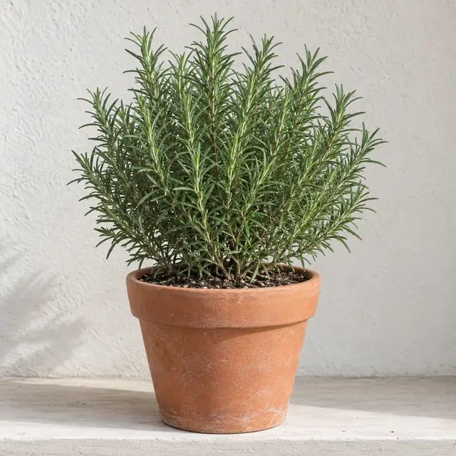
Choose Rosemary needles. The central image and name change with the commentary beside them. Open its observation prompt. On narrow screens, the regions follow navigation, exhibit, explanation in that order.
Select a museum exhibit and update its image and commentaryBOTANICAL MUSEUM
Leaf forms
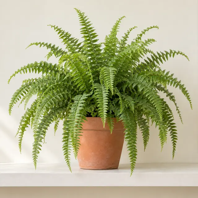
Fern fronds
Shade room
Rosemary needles
Herb room
A fictional demo within this article. Reset or reload restores its initial state.
What: the concept
A multi-region layout coordinates separate page areas. This is page composition, not CSS multi-column text flowing between columns. More regions divide attention and require a clear mobile and keyboard order.
Choose multiple regions when selection, active work and independent context must coexist. A sidebar is simpler when there is one main task and one supporting control area. Region count alone does not prove usability.
02Applications
The museum links each exhibit with its image and observation question. Editors and reference tools can use similar coordination. The generated botanical images illustrate the page structure rather than documenting museum collections.
03Implementation & cautions
CSS Grid places distinct regions; CSS multi-column fragments one content flow. Keep the DOM order navigation → exhibit → explanation and collapse that order on small screens. Update image and context from one selection state.
Already talking with external AI? Share this article link and explain why the choice fits your project and which tradeoff matters. Ask how it applies to your agreed requirements.
Discuss this idea
Comments are shared across languages. GitHub login required to post.