Multiple columns
Compare the same six resources.
Open field noteExplore Column composition.
3 field notes
| Concept | Features | Advantages | Limitations | Suitable situations | Combination conditions |
|---|---|---|---|---|---|
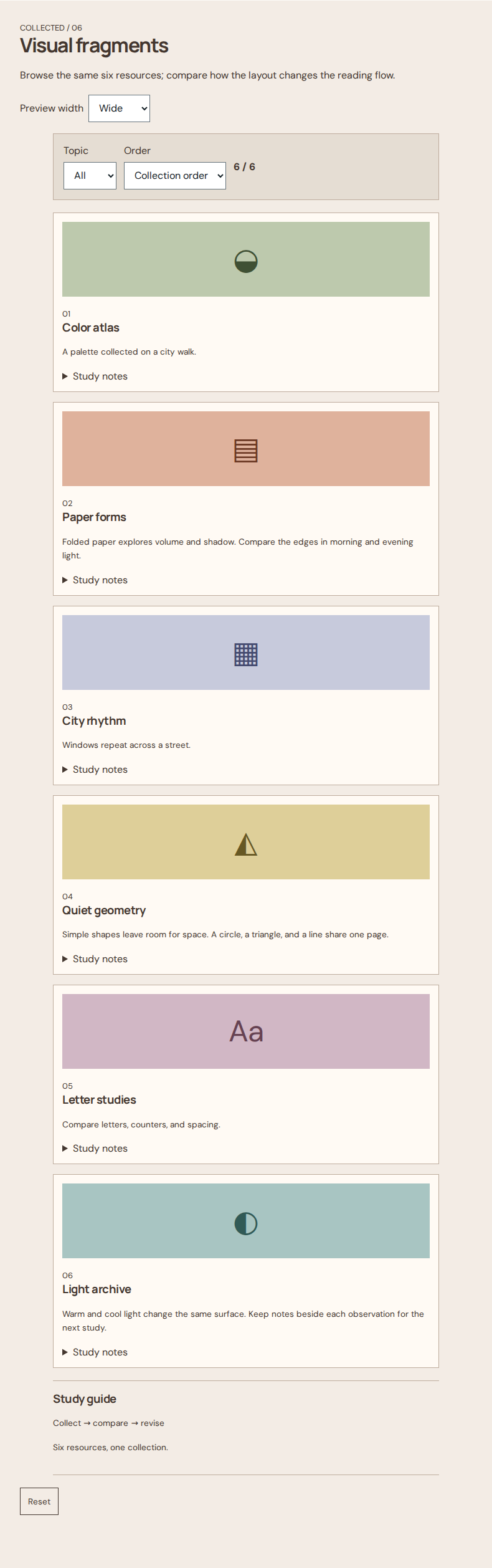
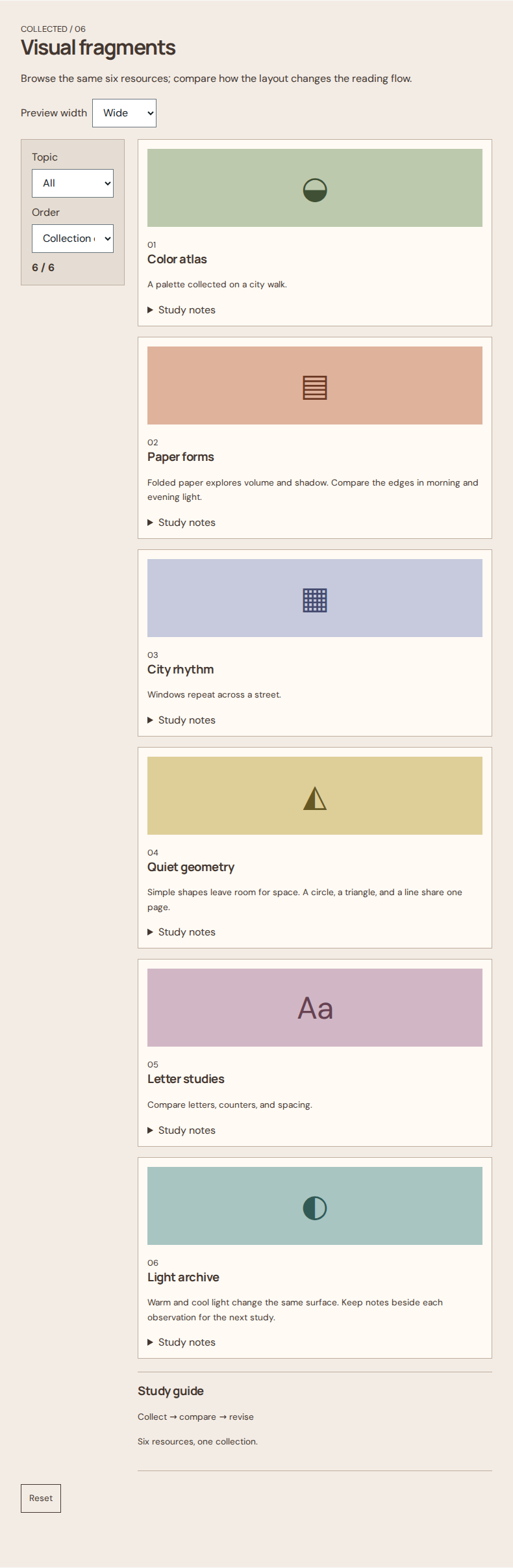
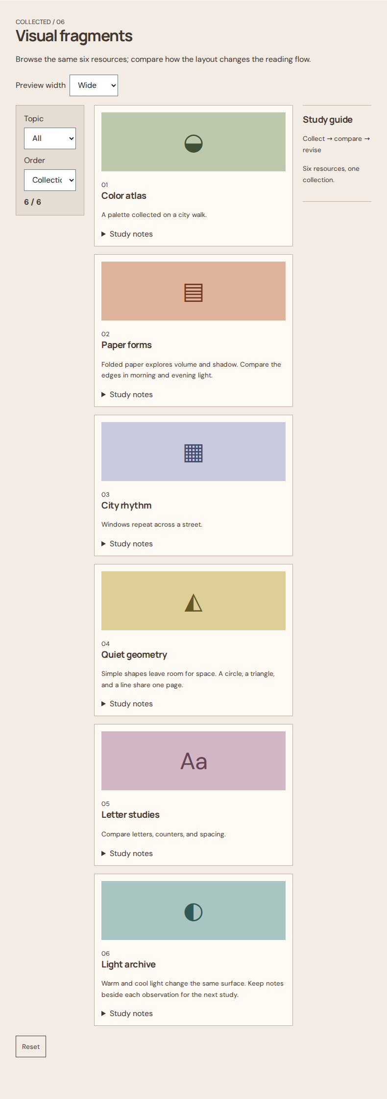
| Multiple columns | Three or more page regions keep navigation, active work, and context nearby. | References remain visible beside active work. | More regions divide attention and need an explicit small-screen order. | Choose it when context must remain visible beside work. | Use flat controls within regions and a single column on mobile. |
| Single column | Filters, resources, and guidance follow one vertical stream. | One stream makes the next reading step predictable. | Long pages require scrolling; a restrained line length helps keep the text manageable. | Choose it for sequential reading. | Combine with minimal styling and a restrained text line length. |
| Two columns | Two adjacent regions separate filters from resources. | Filters stay available beside the resource list. | Sidebars reduce reading width, so stack regions before they become cramped. | Choose it for documentation with persistent navigation. | The main column can contain lists or a resource grid. |