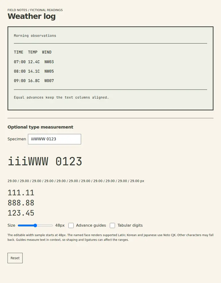
Monospace
Equal character advances suit aligned text data; shape and fallback coverage remain separate concerns.
Open field noteCompare typeface shapes and character widths to balance reading, alignment, and expression.
Search within: Typography
5 field notes
Equal character advances suit aligned text data; shape and fallback coverage remain separate concerns.
Open field note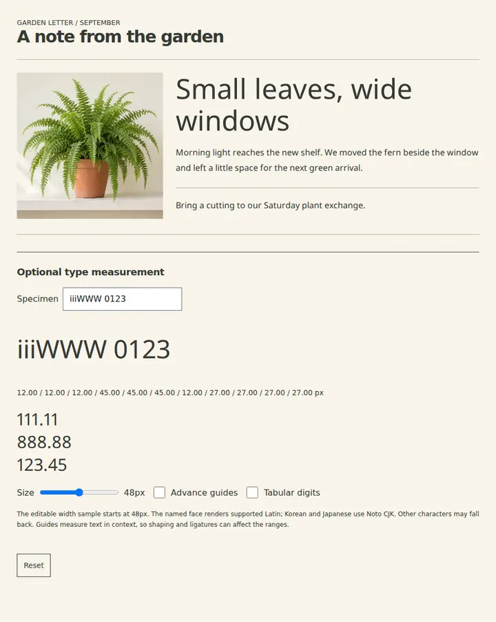
Varying character advances suit flowing text; letter spacing is a separate adjustment.
Open field note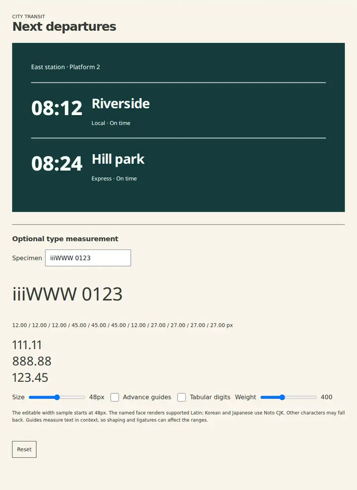
Letterforms without serifs suit a plain visual voice; readability still depends on the chosen face and context.
Open field note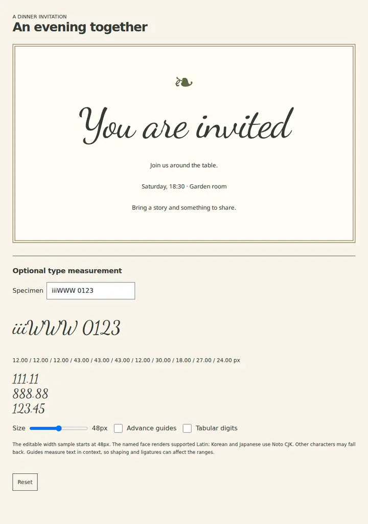
Handwritten strokes suit short expressive lettering while ordinary text carries detailed instructions.
Open field note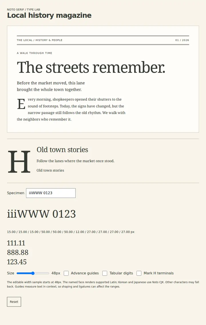
Finishing strokes at letter terminals create a distinct text texture; choose by editorial tone and tested legibility.
Open field note